Canvas制作旋转的太极的示例
发表时间:2018-03-12 15:18作者:zy人气:更新时间:2025-10-17 21:42:26
前言
好久没动canvas了,今下午突然想回顾一下,就写了个旋转的太极,哈哈,蛮好玩的,在这里就将自己写的过程展示出来,旋转使用的css实现的,没有用canvas自己的,希望大佬们不要吐槽。
css
body{
background: #ddd;
}
#canvas{
position: absolute;
left: 40%;
top: 30%;
-webkit-transform: translate(-50%,-50%);
-moz-transform: translate(-50%,-50%);
-ms-transform: translate(-50%,-50%);
-o-transform: translate(-50%,-50%);
transform: translate(-50%,-50%);
-webkit-animation: testAnimate 3s linear infinite;
-o-animation: testAnimate 3s linear infinite;
animation: testAnimate 3s linear infinite;
}
@keyframes testAnimate {
from {
-webkit-transform: rotate(0);
-moz-transform: rotate(0);
-ms-transform: rotate(0);
-o-transform: rotate(0);
transform: rotate(0);
} to {
-webkit-transform: rotate(360deg);
-moz-transform: rotate(360deg);
-ms-transform: rotate(360deg);
-o-transform: rotate(360deg);
transform: rotate(360deg);
}
}
html
<body>
<canvas id="canvas" width="500" height="500">
</canvas>
</body>
js
let ctx = document .getElementById("canvas") .getContext("2d");
// left-black-big ctx.beginPath();
ctx.fillStyle = "#000";
ctx.arc(250,250,200,Math.PI/2,Math.PI*1.5,false);
ctx.closePath();
ctx.fill();
// right-white-big ctx.beginPath();
ctx.fillStyle = "#fff";
ctx.arc(250,250,200,Math.PI/2,Math.PI*1.5,true);
ctx.closePath();
ctx.fill(); // top-black-middle ctx.beginPath();
ctx.fillStyle = "#000";
ctx.arc(250,150,100,Math.PI/2,Math.PI*1.5,true);
ctx.closePath();
ctx.fill();
// bottom-white-middle ctx.beginPath();
ctx.fillStyle = "#fff";
ctx.arc(250,350,100,Math.PI/2,Math.PI*1.5,false);
ctx.closePath(); ctx.fill();
// top-white-small ctx.beginPath();
ctx.fillStyle = "#fff";
ctx.arc(250,150,25,0,Math.PI*2);
ctx.closePath();
ctx.fill();
// bottom-black-small ctx.beginPath();
ctx.fillStyle = "#000";
ctx.arc(250,350,25,0,Math.PI*2);
ctx.closePath();
ctx.fill();
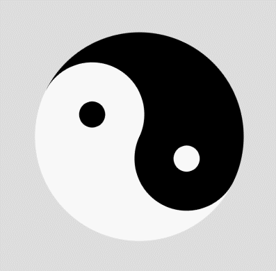
效果
以上就是本文的全部内容,希望对大家的学习有所帮助。
相关推荐
相关下载
热门阅览
- 1精美漂亮网站引导页模板源码
- 2ECharts – 大数据时代必备的数据图表
- 3出现 XMlHttpRequest status:[500] Unknow status 的解决方法
- 4HTML5 Canvas画印章效果代码
- 5CSS实现input默认文字灰色有提示文字点击后消失鼠标移开显示
- 6html网页判断手机还是电脑登陆进入
- 7HTML5 Canvas实现图片缩放、翻转、颜色渐变的代码示例
- 8让人惊叹的的创意404错误页面设计
- 9Html5实现二维码扫描并解析
- 10安装UCenter教程
- 11深入解析HTML的table表格标签与相关的换行问题
- 12纯CSS实现右侧底部悬浮效果(悬浮QQ、微信、微博、邮箱等联系方式)
网友评论